|
These four very different sites—representing a range of size and complexity—illustrate what a Simply Effective website is all about: clear, easy to navigate, and rich in content. Each site carefully matches design and technology to meet the client's needs precisely.
 |
 |
 |
 |
 |
 |
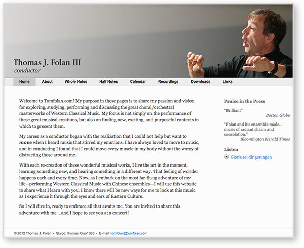
Client: Thomas J. Folan, conductor
http://tomfolan.com
Tom needed a full-featured website to represent himself professionally and advance his career, but he also needed to minimize his costs. WordPress provided the ideal foundation.
I developed a strong, simple visual design for Tom, delivering an affordable website with plenty of music, photojournalistic essays, a blog, and a calendar. Its unique appearance doesn’t give away its humble WordPress roots ...and it’s a website that Tom can update from his laptop as he travels the world.
|
 |
 |
 |
 |
 |
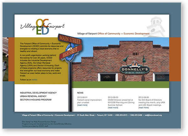
Client: Fairport Office of Economic Development
http://fairportoced.org
A non-profit organization working behind the scenes for over 25 years, the Village of Fairport Office of Community + Economic Development (OCED) has played a significant role in creating the bustling village you see today.
Katy Kuczek (Aurora Design) provided the visual design for OCED's website and I provided the technology. I integrated a robust HTML framework with a simple content management system to create an environment through which Village personnel can update the site with current news stories, project descriptions, meeting minutes, and reports. They also keep the public tuned in to policies and financials, documenting the performance of this unique public/private approach to development.
|
 |
 |
Client: aFrank&co
http://afrankandco.com
Adam Frank is a fine wood craftsman who doubles as a general contractor to handle design, building, and remodeling projects of all kinds and sizes.
Katy Kuczek (Aurora Design) provided the visual design for Adam's website and I provided the technology. This is a fully responsive design, in which a single code framework and five sets of style rules enable this beautiful website to look perfect on everything from a desktop computer with a large monitor to a tablet to a smartphone.
|
 |
 |
 |
 |
 |
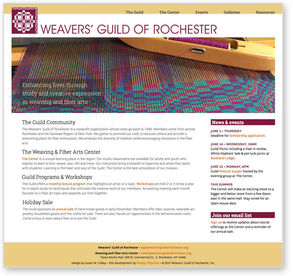
Client: The Weavers' Guild of Rochester
http://weaversguildofrochester.org
With roots that extend back to the 1940s, the Weavers' Guild of Rochester provides a welcoming place for fiber art enthusiasts. Through classes, workshops, and programs, the Guild unites folks who knit, weave, spin, felt and more.
Susan Gilday provided the visual design for a new website while several dedicated Guild members developed content and I provided the technology. Together we produced a responsive design that adapts its display to look great on mobile devices and desktop computers. A foundation of clean, fast-loading HTML and CSS is integrated with a content management system to provide the Guild with a richly-detailed online story, and I've trained a Guild member to update and evolve the site herself.
|
 |
 |
 |
 |
 |
|
|